
What CSS3 Border Image in Hindi?
किसी element के border में image लगाने के लिए border-image property का उपयोग होता है |
css border-image property अन्य properties का समारोह है और वो है:
- border-image-source
- border-image-slice
- border-image-width
- border-image-outset
- border-image-repeat
border-image-source
इस property से image की पाथ सेट की जाती है | इसे url के अंदर लिखी जाती है |
उदाहरण
border-image-source: url(images/borderimage3.png);
border-image-slice
image की कितने हिस्से को border में लगानी है उसे इस property से बताई जाती है और ये value को pixel में ही रहती है इसलिए pixel लिखने की जरुरत नहीं पड़ती |
border-image-repeat
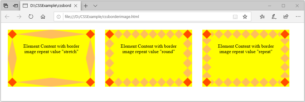
ये property image को कैसे border में सेट करनी है वो बताती है | इसकी 3 values होती है और वो है : stretch, repeat, round |
- stretch – stretch default value होती है | इसमें image border के चारों corner में सही से दिखाई देती है और बाकिके area में stretch होकर पूरी width को cover करती है |
- repeat – repeat value से image पुरे width में repeat होकर दिखाई देती है | पर image के साइज़ के हिसाब से corner के करीब थोड़ी कटी हुयी आती है |
- round – round value से image पुरे border की width में अच्छे से सजी हुयी आती है |
उदाहरण:
<html>
<head>
<style>
div{
   border: 30px solid black;
   padding: 15px;
   margin: 15px;
   text-align:center;
   width: 200px;
   height: 100px;
   display:inline-block;
   background-color:yellow;
  }
 .box1 {
  border-image-source: url(images/border1.png);
  border-image-slice: 27;
  border-image-repeat: stretch;
}
.box2 {
  border-image-source: url(images/border1.png);
  border-image-slice: 27;
  border-image-repeat: round;
}
.box3 {
  border-image-source: url(images/border1.png);
  border-image-slice: 27;
  border-image-repeat: repeat;
}
</style>
</head>
<body>
 <div class="box1">Element Content with border image repeat value "stretch"</div>
 <div class="box2">Element Content with border image repeat value "round"</div>
 <div class="box3">Element Content with border image repeat value "repeat"</div>
</body>
</html>
output
border-image-outset
इस property से element की content और उसकी border की दुरी को नियंत्रित की जाती है |
उदाहरण:
<html>
<head>
 <style>
  .box2 {
    border: 20px solid black;
    padding: 15px;
    margin: 15px;
    text-align:center;
    width: 200px;
    height: 100px;
    display:inline-block;
    background-color:yellow;
    border-image-source: url(images/border1.png);
    border-image-slice: 27;
    border-image-repeat: round;
    border-image-outset:15px;
   }
  </style>
 </head>
 <body>
  <div class="box2">Element Content with border image repeat value "round"</div>
 </body>
</html>
output
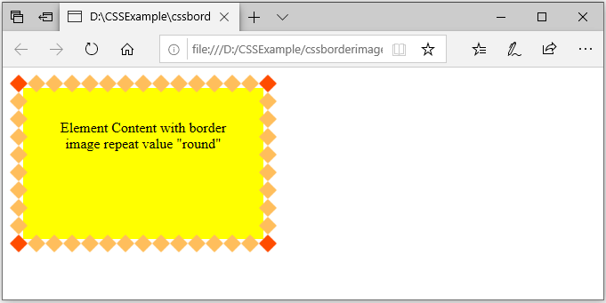
output में देखिये border-image-outset value सेट करके हमने border image को element के बाहार की तरह सजा दीया है |
border-image-width
border-image की width यानि चौडाई को सेट करने के लिए इस property का उपयोग होता है | इस property से border में लगने वाली image की size को control कर सकतें हैं |
उदाहरण:
<html>
<head>
 <style>
  .box2 {
    border: 20px solid black;
    padding: 15px;
    margin: 15px;
    text-align:center;
    width: 200px;
    height: 100px;
    display:inline-block;
    background-color:pink;
    border-image-source: url(images/border1.png);
    border-image-slice: 27;
    border-image-repeat: round;
    border-image-width:30px;
   }
  </style>
 </head>
 <body>
  <div class="box2">Element Content with border image repeat value "round"</div>
 </body>
</html>
output
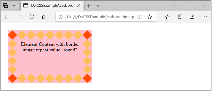
ऊपर के आउटपुट में देखिये जो image border है उसकी width ज्यादा देने की वजह से border बड़ी दिख रही है |
border-image shorthand
border-image properties group के सारे properties को हम एक ही line में लिख सकतें हैं | और ये border-image shorthand property के जरिये लिखेंगे |
border-image syntax
border-image: source | slice | width | outset | repeat;slice, width और outset properties में value हम numeric में डालतें हैं | इसीलिए इसकी value को / (forward slash) से अलग करके लिखेंगे |
उदाहरण
border-image: url(images/border1.png) 27 / 30px / 20px round;border image मे source और repeat value को सिर्फ space से अलग करके लिख सकतें हैं और बाकि के border image properties को / (forward slash) से अलग करके लिखी जाती है |
notepoint: अगर आपके पास photoshop है तो आप उसमे किसी image की slice सही से निकल पाएंगे border में लगाने के लिए | पर आपके पास नहीं है और आपको image की सही slice पता करनी है तो आप निचे दिए गए link पे image upload करके आसानी से जान पाएंगे |
https://developer.mozilla.org/en-US/docs/Web/CSS/CSS_Backgrounds_and_Borders/Border-image_generator
ये link mozilla firefox browser पे सही से काम करता है | अगर आप beginner हैं और border image पे practice करना चाहतें हैं तो इस link पे border-image-slice निकालने में बहोत मदद करेगी |