CSS Gradients in Hindi
CSS Gradients से दो या दो से अधिक colour mix करके smooth transition बनाया जाता है | किसी element की background को ज्यादा आकर्षित बनाने के लिए CSS Gradient का इस्तेमाल होता है |
gradient function को background, background-image और border-image property में लिखी जाती है | इसमे colors को ,(comma) से separate करके लिखी जाती है |
CSS Gradients Type
CSS3 में Gradient 3 प्रकार के होतें हैं :
- Linear Gradient
- Radial Gradient
- Conic Gradient
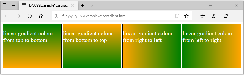
Linear Gradient
Linear Gradient में colours एक side से दुसरे side में transition होता है | यानि colour line wise mix होके transition लाता है |
जैसे की उपर से निचे, निचे से ऊपर, दायीं से बायीं की और या फिर बायीं से दायीं की और transition बनाता है |
Syntax:
background: linear-gradient(to <direction>, color1, color2, color3);
direction में color को कैसे दिखाना है वो बताई जाती है | इसमें to top, to bottom, to left, to right value दी जाती है |
उदाहरण:
<html>
 <head>
  <style>
   .childclass{
    height : 150px;
    width : 200px;
    border: 1px solid black;
    display: inline-block;
    color: white;
    font-size: 20px;
   }
   #div1{
    background-image:linear-gradient(to bottom, green,orange);
   }
   #div2{
    background-image:linear-gradient(to top, green,orange);
   }
   #div3{
    background-image:linear-gradient(to left, green,orange);
   }
   #div4{
    background-image:linear-gradient(to right, green,orange);
   }
  </style>
 </head>
 <body>
  <div class="parentclass">
   <div class="childclass" id="div1">
    <p>linear gradient colour from top to bottom</p>
   </div>
   <div class="childclass" id="div2">
    <p>linear gradient colour from bottom to top</p>
   </div>
   <div class="childclass" id="div3">
    <p>linear gradient colour from right to left</p>
   </div>
   <div class="childclass" id="div4">
    <p>linear gradient colour from left to right</p>
   </div>
  </div>
 </body>
</html>
output:
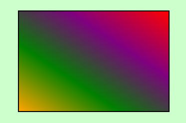
color को corner के लिए भी set कर सकतें हैं और angle के हिसाब से भी सेट कर सकतें हैं |
corner की तरफ transition देने के लिए direction में value देनी होगी जैसे की to bottom left, to bottom left, to top right, to top left |
और angle में transition देने के लिए value deg के साथ लिख सकतें हैं जैसे की 90deg या 45deg |
उदाहरण:
<html>
 <head>
  <style>
   body{background-color:#CCFFCC;}
   .class1{
    height : 200px;
    width : 300px;
    border: 2px solid black;
    margin: 80px auto 00px auto;
   }
   #div1{
    background:linear-gradient(to top right, orange, green, purple, red);
   }
  </style>
 </head>
 <body>
  <div class="class1" id="div1"></div>
 </body>
</html>
output:
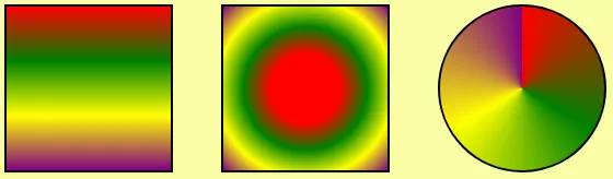
Radial Gradient
radial gradient में color transition होना किसी side से सुरु नहीं होता है, बलकी इसमें transition center से या फिर किसी point से सुरु होता है |
ये एक center define करता है और उस center से color transition सुरु करता है | radial gradient के लिए कम से कम दो color होना जरुरी है |
Syntax
background-image: radial-gradient(shape size at position, color1, color2,color3…);
- shape : shape value gradient की shape बताता है | इसकी दो value हैं और वो है 1) circle, 2) eclipse(default value)
- size : gradient की size बताता है और इसकी values हैं: 1) farthest-corner (default), 2) closest-side, 3) closest-corner, 4) farthest-side
- position : gradient की position बताता है | default position है center |
- color1, color2… : ये सब color हैं जिससे gradient बनेगी | सारे colors को , comma से अलग करके लिखी जाती है | color को name से या फिर rgb color या hexacode के जरिये लिख सकतें हैं |
Sample Code:
#div1{
background:radial-gradient(circle closest-side at 30% 40%, orange, red, green, purple);
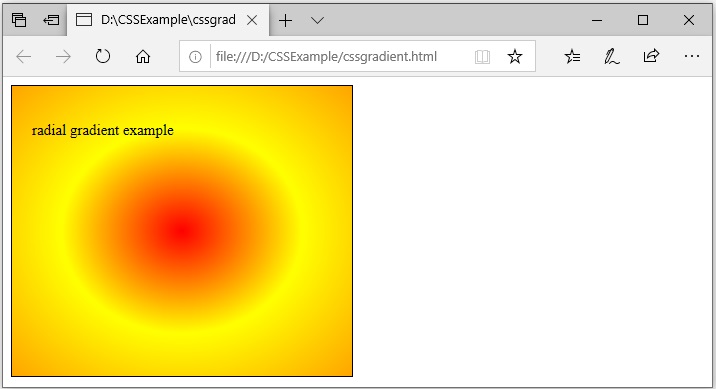
} अब चलिए radial gradient को उसके अलग अलग value से उदाहरण में समझतें हैं | पेहले उदाहरण में सिर्फ color देकर transition बनातें हैं |
उदाहरण:
<html>
 <head>
  <style>
   .childclass{
    height : 250px;
    width :300px;
    border: 1px solid black;
    font-size: 15px;
    padding:20px;
   }
   #div1{
    background-image:radial-gradient(red, yellow ,orange);
   }
  </style>
 </head>
 <body>
  <div class="parentclass">
   <div class="childclass" id="div1">
    <p>radial gradient example</p>
   </div>
  </div>
 </body>
</html>
output:
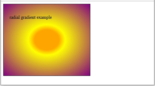
radial gradient में color को percentage में भी दे सकते हैं | जिस color को जितना percentage मिलेगा वो उतना transition करेगा |
उदाहरण:
#div1{
    background:radial-gradient(orange 20%, yellow 30%,purple);
   }
output:
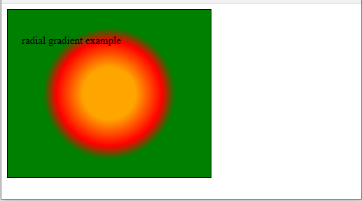
radial gradient में transition का जो shape होता है वो default eclipse होता है | पर shape parameter circle value देकर transition को circle बना सकतें हैं |
उदाहरण:
#div1{
    background:radial-gradient(circle, orange 20%, red 40%, green 50%);
   }
output:
radial gradient center का point बदल सकतें हैं | उसके लिए
- at top
- at bottom
- at left
- at right
जैसी value दे सकतें हैं | इन values के आलावा % percentage या pixel में भी value दे सकतें |
उदाहरण:
background:radial-gradient(circle at 50px, orange 20%, red 40%, green 50%);
background:radial-gradient(circle at 30%, orange 20%, red 40%, green 50%);
background:radial-gradient(circle at top, orange 20%, red 40%, green 50%);
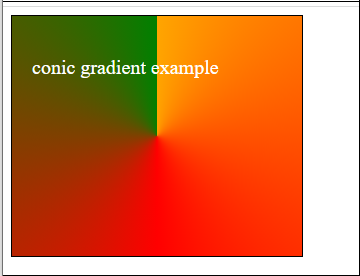
Conic Gradient
Conic Gradient में पेहली color से gradient एक point से बनना सुरु होता है | और पूरा gradient बनाकर उसी point पे आखिरी color से ख़तम करता है |
उदाहरण:
<html>
 <head>
  <style>
   .childclass{
    height : 200px;
    width :250px;
    border: 1px solid black;
    font-size: 20px;
    padding:20px;
    color:white;
   }
   #div1{
    background:conic-gradient(orange, red, green);
   }
  </style>
 </head>
 <body>
  <div class="parentclass">
   <div class="childclass" id="div1">
    <p>conic gradient example</p>
   </div>
  </div>
 </body>
</html>
output:
Sample Code
<html>
 <head>
  <style>
   body{background-color:#CCFFCC;}
   .class1{
    height : 150px;
	width :150px;
    border: 2px solid black;
	float: left;
	margin:20px;
	border-radius: 50%;
   }
   #div1{
    background:conic-gradient(orange, red, green,purple,white);
   }
   #div2{
    background:conic-gradient(from 60deg, orange, red, green,white);
   }
   #div3{
    background:conic-gradient(orange, red, green,orange);
   }
   #div4{
    background:conic-gradient(orange, red 180deg, green);
   }
  </style>
 </head>
 <body>
  <div class="class1" id="div1"></div>
  <div class="class1" id="div2"></div>
  <div class="class1" id="div3"></div>
  <div class="class1" id="div4"></div>
 </body>
</html>
output:
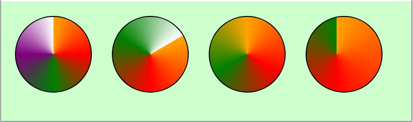
ऊपर के उदाहरण में हमने 4 div लिया है और हर div में conic gradient method को लगाया है | और कुछ extra parameter के साथ अलग अलग look दिया है div को | तो चलिए समझतें हैं कोनसा div में क्या change हुआ है |
- div1 में 5 colors से conic gradient बनायी गयी है |
- div2 में 5 colors से conic gradient बनायी गयी है और साथ ही साथ starting point को from property के जरिये 60degree angle में सेट किया है |
- starting point को अगर आप hide करना चाहतें हैं तो जिस color से gradient सुरु किये हैं उसी color से gradient को ख़तम करें | div3 में हमने orange color से gradient को सुरु किया और ख़तम भी उसी color से किया | इसीलिए gradient starting point hide हो गया है |
- div4 में gradient की starting angle को move किया है | at 40% 50% के जरिये starting angle को top से 40% और left से 50% move किया है |
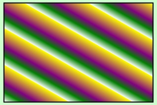
Repeating Linear Gradient
repeating-linear-gradient में linear gradient repeat होकर दिखाई देता है | इसमें हम जितने भी color लेते हैं उन्हें % percentage से set करतें हैं ताकि colors repeat होकर दिखाई दे |
उदाहरण:
<html>
 <head>
  <style>
   body{background-color:#CCFFCC;}
   .class1{
    height : 200px;
    width : 300px;
    border: 2px solid black;
    margin: 80px auto 00px auto;
   }
   #div1{
    background:repeating-linear-gradient(30deg, white, green, purple 10%, yellow 20%);
   }
  </style>
 </head>
 <body>
  <div class="class1" id="div1"></div>
 </body>
</html>
उदाहरण में 4 colors लिया गया है और direction को 30deg में सेट कि गयी है | 4 colors में yellow को 20% और purple को 10% दिया गया है | तो ये दो color उतना percentage लेगा और बाकि area में दुसरे दो colors repeat होंगे |
output:
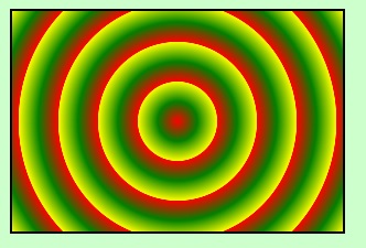
Repeating Radial Gradient
repeating-radial-gradient में radial gradient repeat होकर दिखाई देता है | इसमें हम जितने भी color लेते हैं उन्हें % percentage या pixel से set करतें हैं ताकि colors repeat होकर दिखाई दे |
उदाहरण:
<html>
 <head>
  <style>
   body{background-color:#CCFFCC;}
   .class1{
    height : 200px;
    width : 300px;
    border: 2px solid black;
    margin: 20px;
   }
   #div1{
    background:repeating-radial-gradient(circle, red, green 10%, yellow 20%);
   }
  </style>
 </head>
 <body>
  <div class="class1" id="div1"></div>
 </body>
</html>
output:
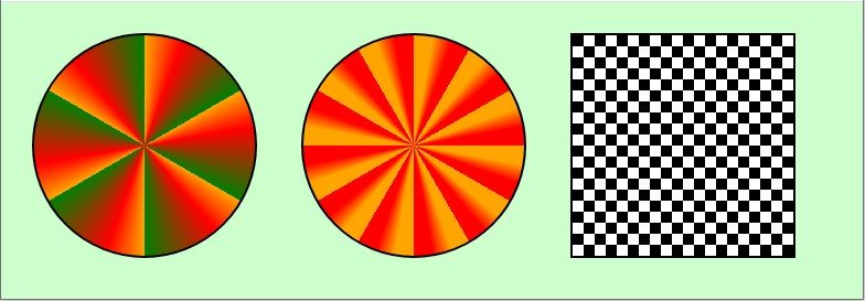
Repeating Conic Gradient
repeating-conic-gradient में conic gradient repeat होकर दिखाई देता है | इसमें हम जितने भी color लेते हैं उन्हें % या degree से set करनी पड़ती है ताकि color repeat हो सके |
उदाहरण:
<html>
 <head>
  <style>
   body{background-color:#CCFFCC;}
   .class1{
    height : 200px;
    width : 200px;
    border: 2px solid black;
    float: left;
    margin:20px;
    border-radius: 50%;
   }
   #div1{
    background:repeating-conic-gradient(orange 0deg, red 20deg, green 60deg);
   }
   #div2{
    background:repeating-conic-gradient(orange 0deg, orange 10deg, red 20deg, red 30deg);
   }
   #div3{
    background:repeating-conic-gradient(white 0deg, white 90deg, black 90deg, black 180deg);
    background-size : 20px 20px;
    border-radius: 0;
   }
  </style>
 </head>
 <body>
  <div class="class1" id="div1"></div>
  <div class="class1" id="div2"></div>
  <div class="class1" id="div3"></div>
 </body>
</html>
output: